What to Wear for Professional Business Headshots
Bringing the right outfits to your business headshot session is more important than you might think.
A professional headshot is often the first impression clients, colleagues, and potential employers have of you, and also your company. The right outfit helps keep the focus on your face while communicating confidence, professionalism, and approachability.
Here are a few important guidelines to help you choose clothing that photographs beautifully, and will help communicate your company’s message and brand.

Choose Colors That Flatter You And Fit With The Company’s Branding.
The best colors for business headshots are typically solid colors, or very simple patterns that are matched with a solid color.
The “right” colors dpeends on what you are trying to communicate with your headshots.
Lighter or neutral colors can communicate friendliness and casual approachability. Dusty blue, khaki, and pale sage green are all good examples of lighter friendly colors.
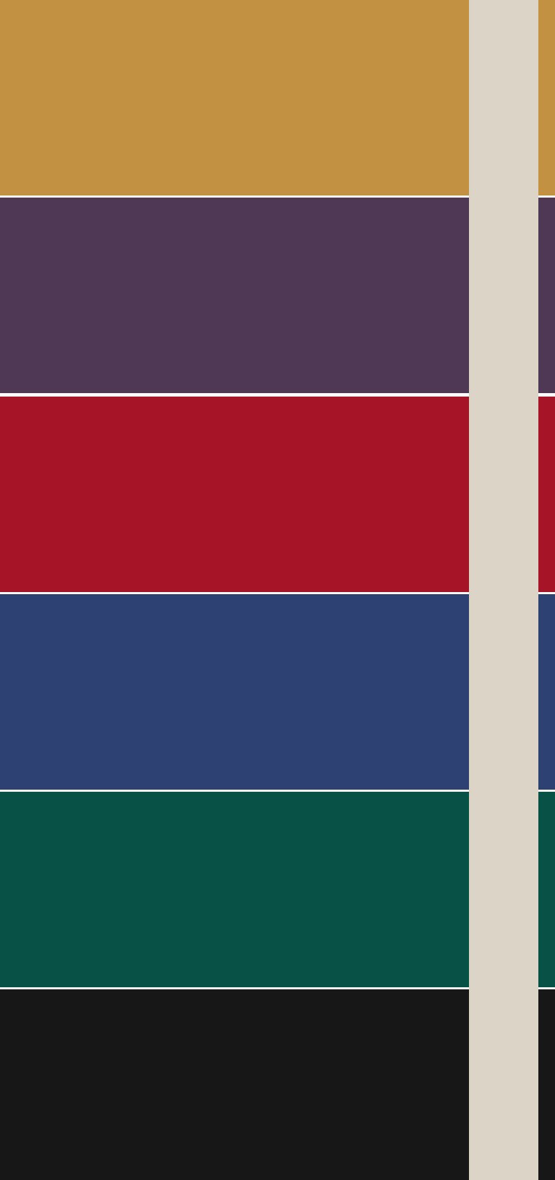
If you’d like to communicate a bit more professionalism and “weight,” choose medium-to-rich tones that complement your skin tone and eye color. Navy, charcoal, forest green, burgundy, teal, and jewel tones tend to photograph well on most people.
Whenever possible, avoid:
Neon or extremely bright colors that reflect onto your skin.
Pure white, which can lose detail under studio lighting, unless it’s under a blazer.
Pale pastel colors, which nearly always wash out skin tones and look dirty on camera.
Busy prints, large logos, or bold graphics that draw attention away from your face.
If you're unsure, a solid-colored top is almost always the safest choice. Your expression should be what people remember—not your shirt.
Clothing Shape & Style
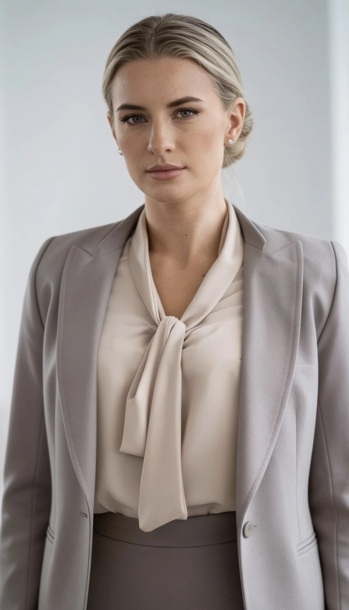
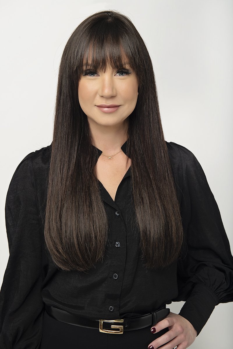
For women, it’s usually best to choose a top that with help lengthen the neck. We recommend lower necklines like this V-neck.
Make sure the top isn’t TOO low! We do not want cleavage showing in your headshots.
We always recommend a ¾ or full sleeve for your top. The eye goes to where the skin is, so bare arms will quickly steal attention away from your expression. Short sleeves can be ok, but we never recommend sleeveless tops for professional headshots.
Make sure your clothing fits you well. Your top should be fitted, but not so tight that is pulls or tugs awkwardly when you move.
A common issue is a button-up shirt that pulls open at the buttons at the bust when you move your arms. Make sure your blouse is large enough to move around in freely, but not so big that it is baggy or boxy on you.
Fabrics Matter
Your fabric choices will affect what is being communicated through your headshot.
If your goal is to appear casual and natural, choose softer fabrics like cotton, wool, and linen (carefully ironed, though - wrinkles never make a good impression).
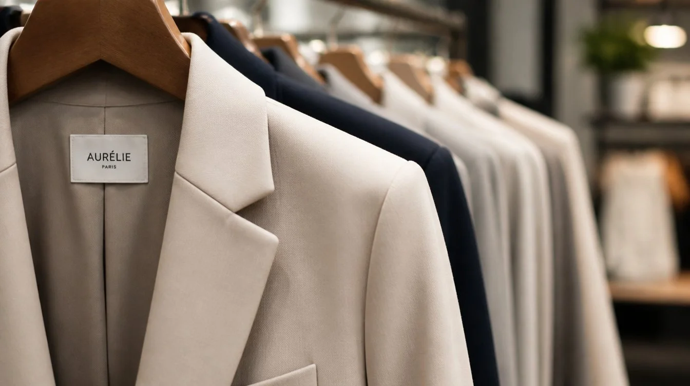
If your goal is to appear highly professional, choose high-end fabrics like chiffon or satin for women. Cotton and linen can also be considered for high-end looks - just be careful about pattern and design.
We only have a few things to avoid altogether when choosing fabrics -
Avoid velvet - it sucks up all the light and doesn’t easily show definition.
Try to avoid very shiny fabrics - they tend to reflect with a high contrast when we use the studio lighting. Silk seems like a nice choice, but can often be too reflective for headshots.
For Full Company Headshots, Keep Outfits Cohesive
If your entire team is getting headshots done for a company website, consistent branding is important.
Consider three things when selecting colors for your team:
Website color scheme & company logo colors
For instance, if your logo has cobalt blue in the graphic, you wouldn’t want your team wearing pale blue, or bold orange (directly contrasting colors can be a loud statement).
Your background choice
For instance: if you have opted for a white background for your company’s headshots, you wouldn’t want your team wearing solid white…. or if a black background, then a black top wouldn’t work well.
Company branding
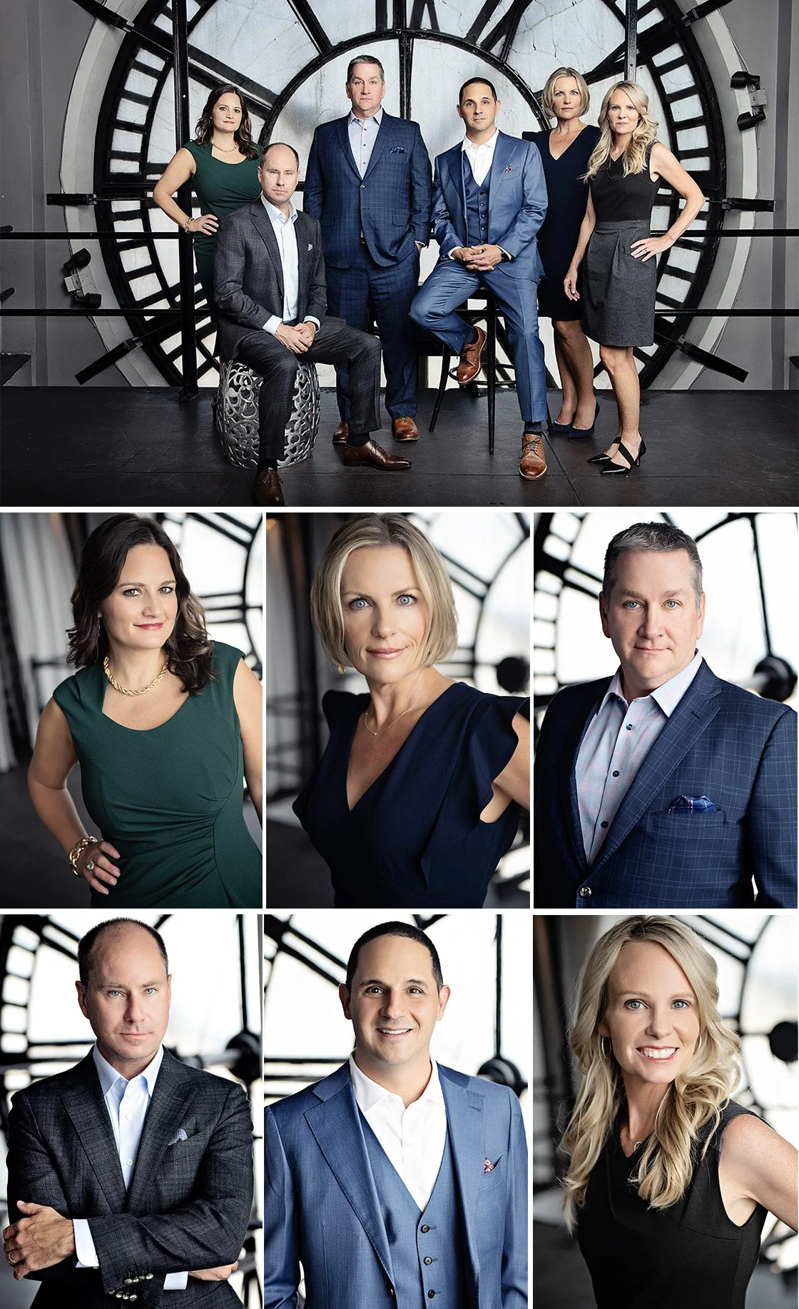
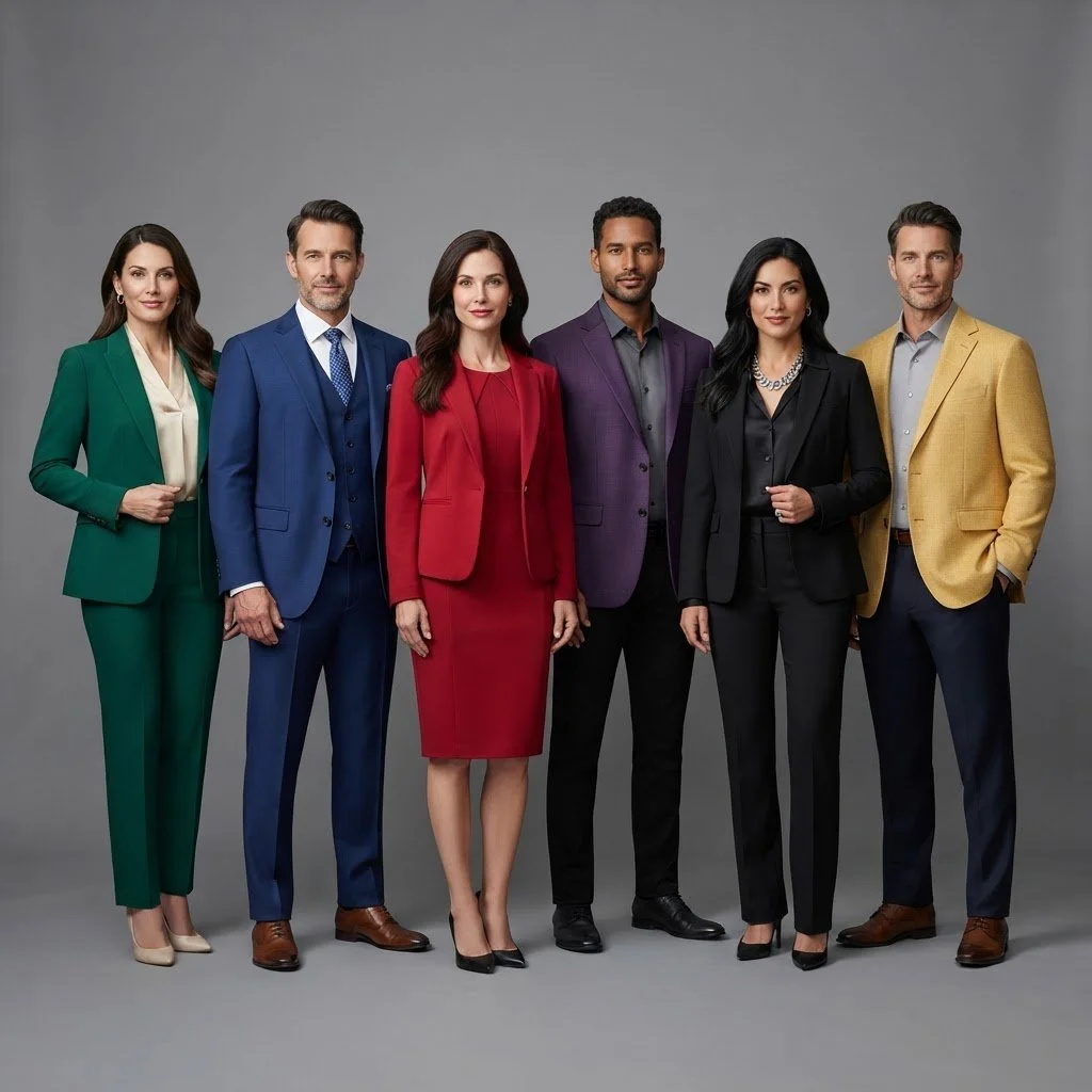
If your company is a high-end law firm, like this example, then pastel colors may not communicate your brand well, and you would probably prefer to go with powerful tones like navy blue, black, emerald green, or maroon.
Have your team bring solid colors only (or very minimal patterns), and choose 5-6 colors for them to pick from that will not conflict with your website and logo.
Include at least 2 neutral tones in your color choices, such as medium or light gray, black, cream, white, or khaki (depending on your company brand), and then pick 3-4 more color options that fit with your branding.
Here are some popular color options for team headshots.
(Feel free to copy/save/screenshot these images and send directly to your team if you like any of these color combinations!)



Medium blue, cream, white, sage green, pale maroon, light gray
Neutrals
Black, Gray, Khaki, Brown, Cream, White
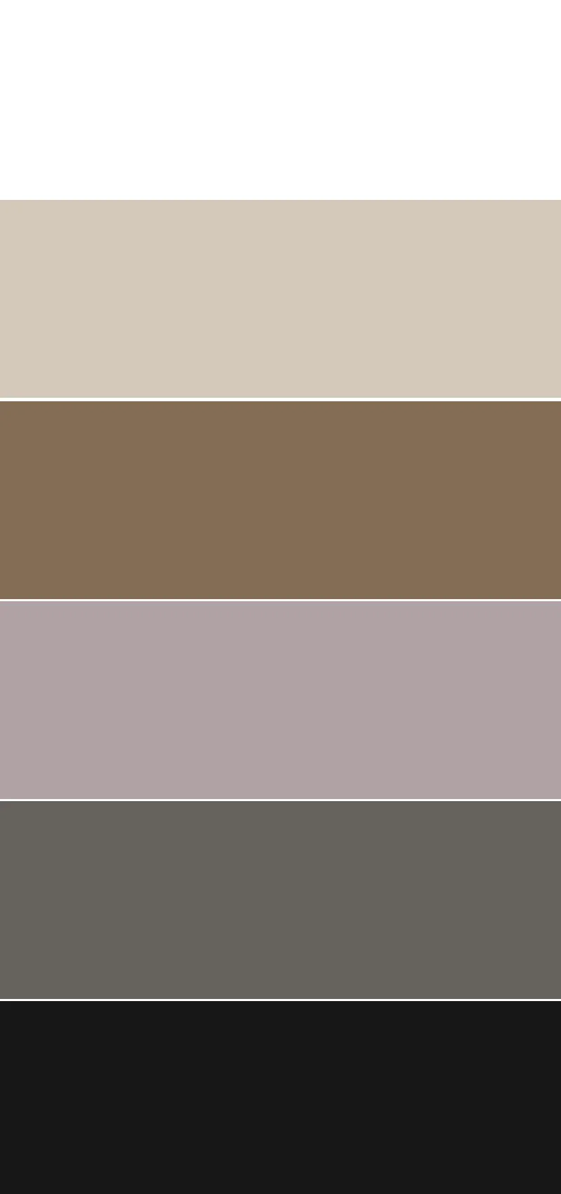
Casual & Approachable
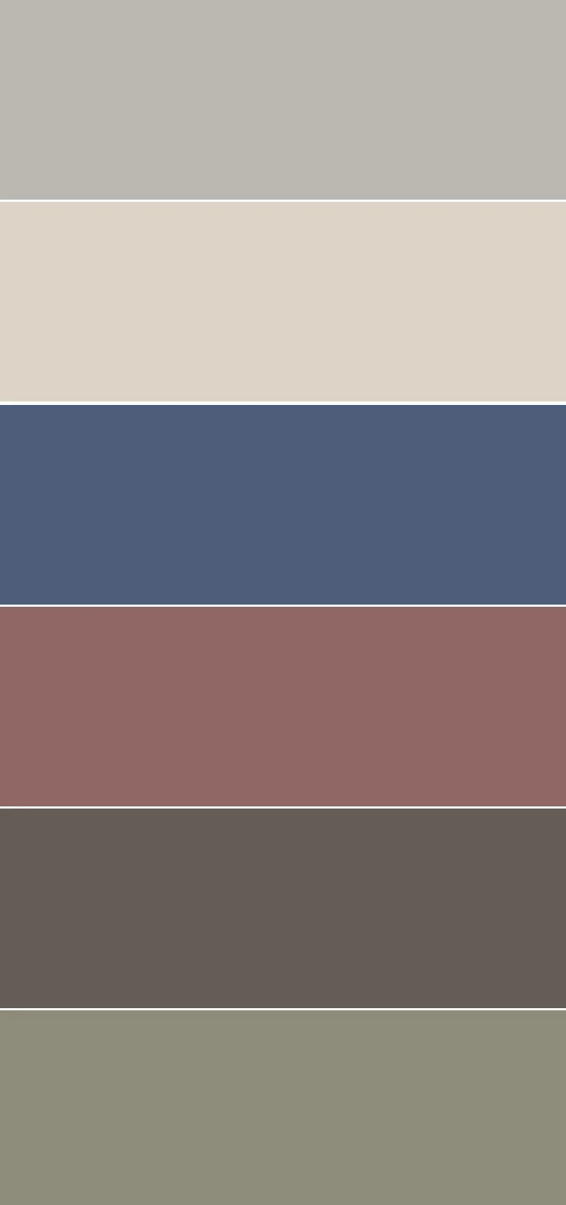
MonochromaticJewel Tones
Shades of one tone + a common neutral
Examples:
Shades of blue + cream
Black, gray & white
Shades of brown: cream, khaki, tan, chocolate
Black, cream/white, gray + a jewel tone (emerald green, sapphire blue, ruby red, amethyst purple, deep teal, citrine yellow)